Twenty Two Liberty
A waterfront identity built entirely around light, reflection, and extraordinary views.
For over 13 years we’ve worked with The Fallon Company on Fan Pier, transforming this 21-acre site into a vibrant, exciting, world-class neighborhood and Boston’s new urban center. We have marketed three residential buildings, office, retail, and events as well as parks and a six-acre marina.
Client
The Fallon Company
Industry
Real Estate, Luxury Residential
Scope of Work
Brand Strategy, Brand Identity, Advertising, Photography, Signage, Print Collateral, Website, Sales Center Graphics, App Collaboration, Video
The Challenge
Before Twenty Two Liberty launched, the Seaport—and Fan Pier in particular—was still unfamiliar territory for many high-net-worth buyers.
Our branding and marketing program needed to translate that visual poetry into a compelling narrative capable of attracting an elite audience, many of whom had never considered moving into the Seaport before.
Despite its potential, the area required a stronger sense of identity and destination. At the same time, Twenty Two Liberty had to persuade an elite suburban audience to invest in a new neighborhood while justifying the promise of a luxury lifestyle experience.
The brand needed to deliver confidence, clarity, and aspiration—convincing empty nesters and world travelers alike that Fan Pier was Boston’s next great waterfront address.
The Solution
Twenty Two Liberty introduced a new level of luxury to Boston’s Fan Pier—an architectural statement defined by sweeping glass, quiet elegance, and unobstructed harbor views.
This foundation established awareness and credibility, setting the stage for a true luxury launch.
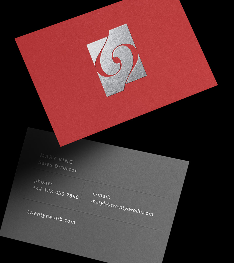
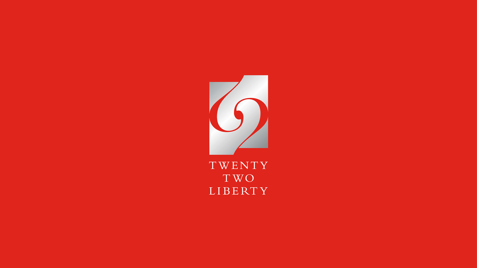
For Twenty Two Liberty, we centered the identity around its defining asset: the water. The sculptural logo—two mirrored “2”s—captures reflected sails, yacht hulls, and the shifting light on the harbor, echoing the building’s curved glass façade. The entire marketing system amplified this theme with spectacular view photography and the direct, memorable message: “What do you see outside YOUR front door?”
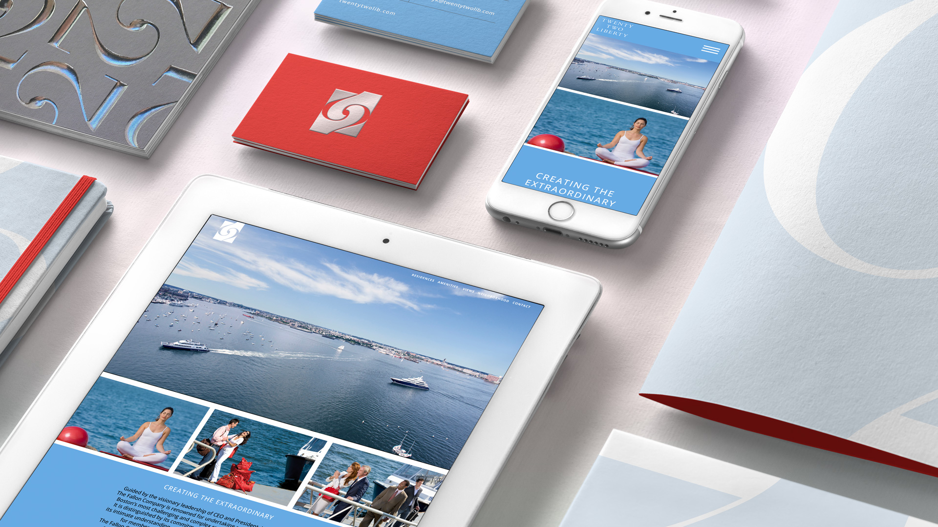
Every touchpoint—from the brochure and signage to digital tools and the sales center—immersed prospects in the Fan Pier lifestyle: effortless, calm, and anchored in extraordinary views. The campaign extended the placemaking work, positioning Fan Pier not as a future destination, but as the luxury waterfront neighborhood in Boston.
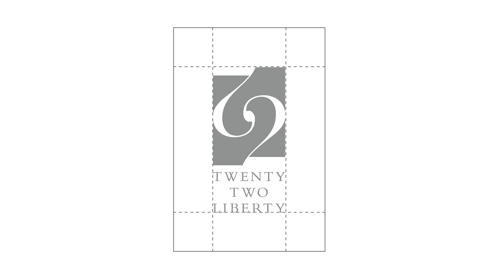
The sculptural logo—two mirrored “2”s—captures reflected sails, yacht hulls, and the shifting light on the harbor, echoing the building’s curved glass façade.
Elegant Cormorant Garamond supports the curves and sharp edges of the logo. Avenir Light reinforces the brand’s architectural clarity—crisp, modern, and subtly refined.
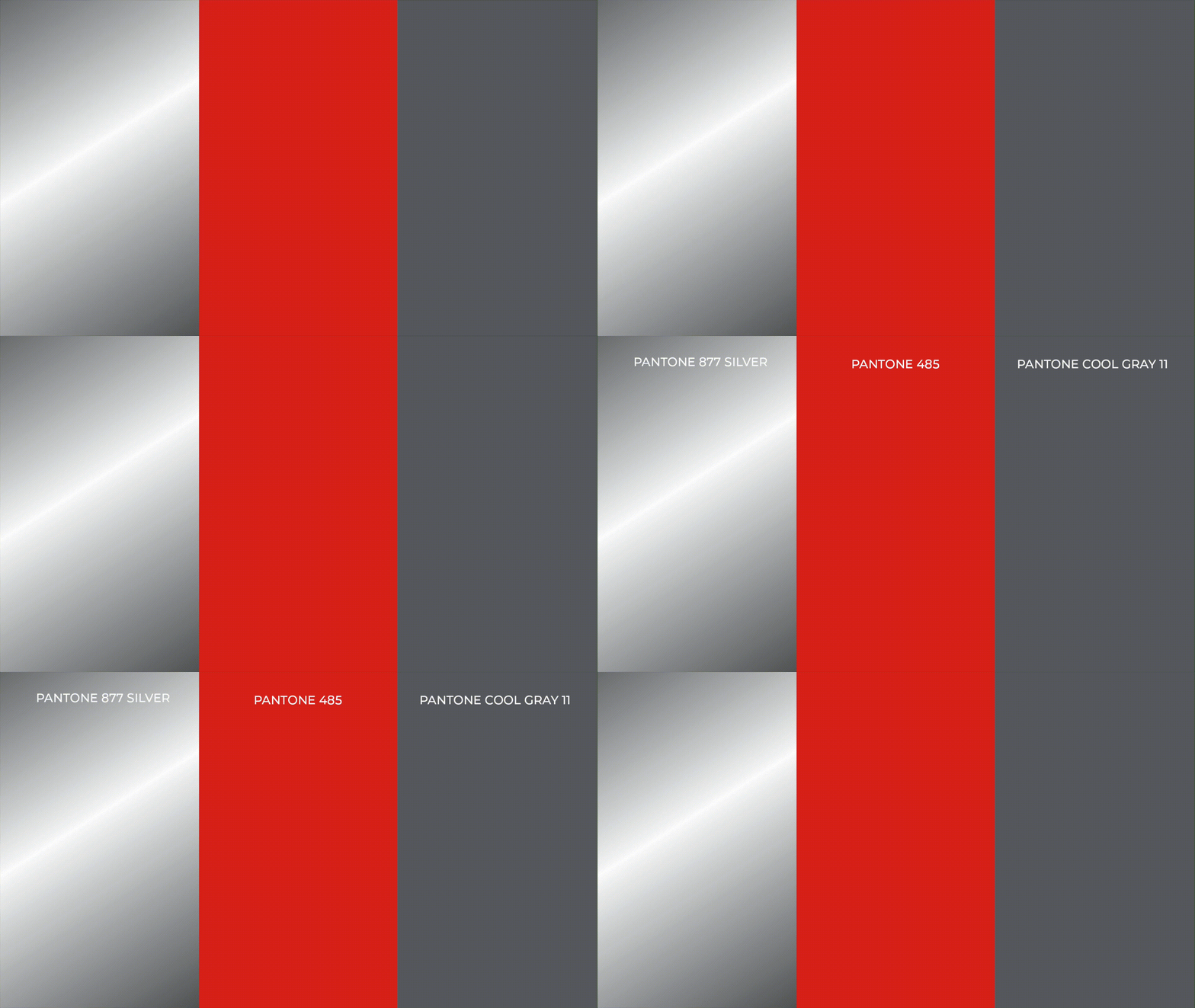
A calibrated mix of silvers, deep grays, and vivid red evokes the interplay of water, the chrome on yachts, and urban sophistication.
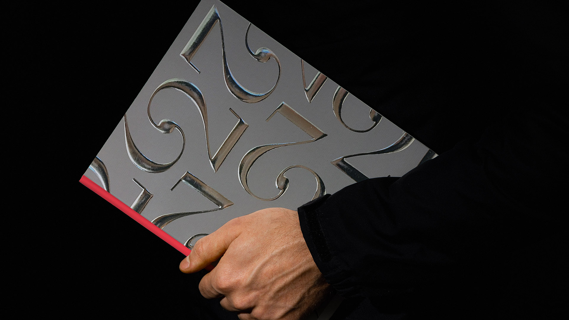
Brochures, signage, and digital tools immersed prospective buyers in the full luxury experience.
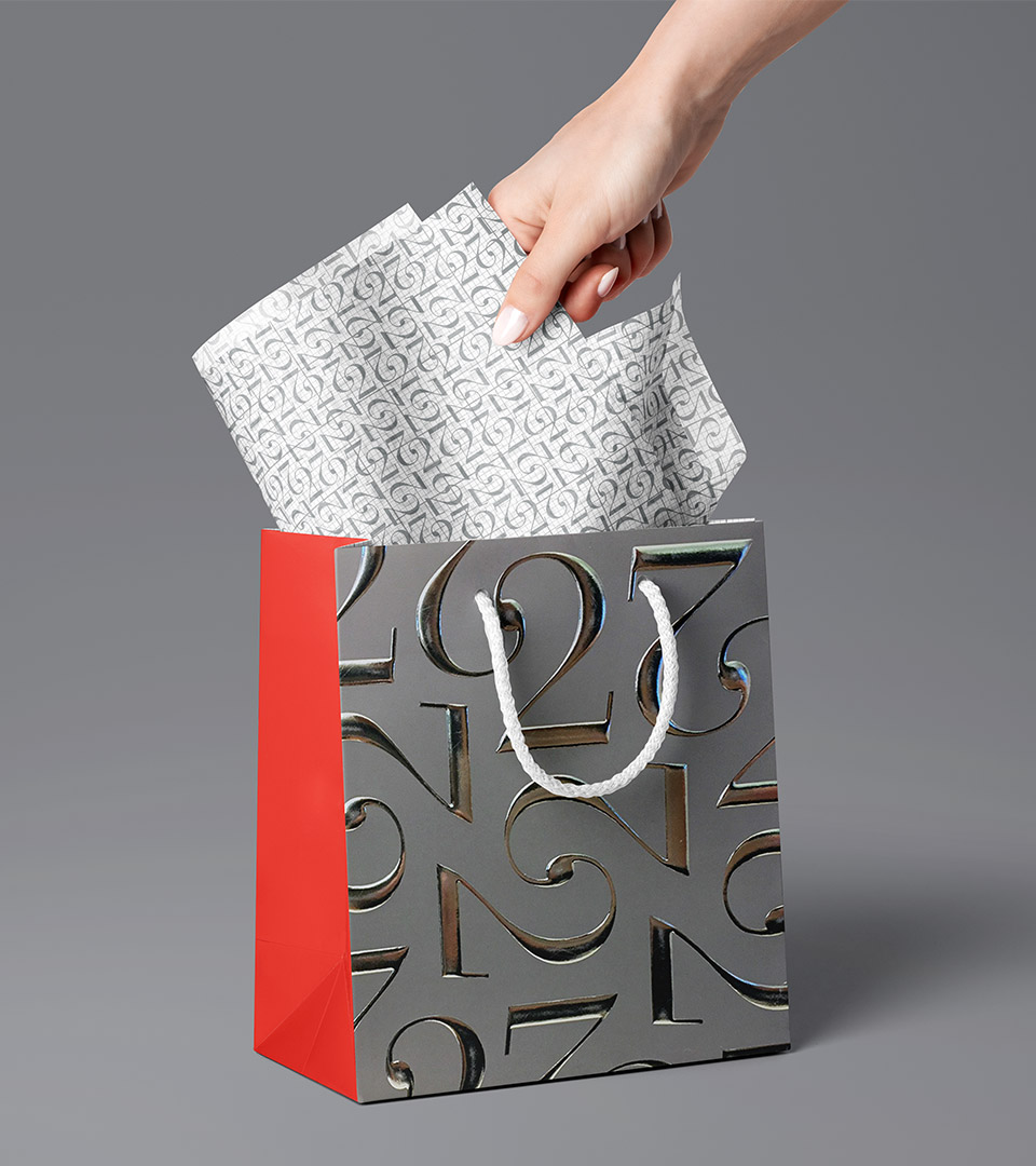
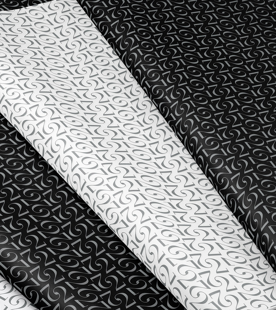
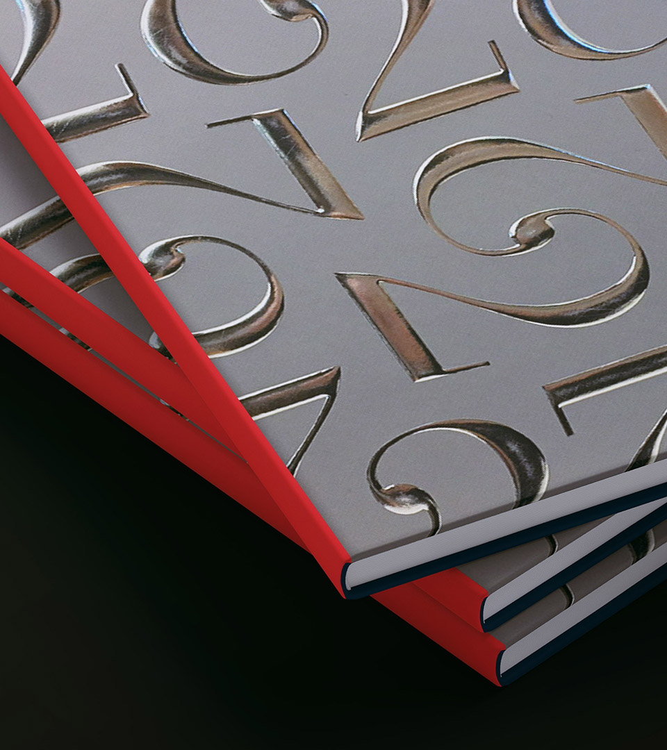
The repeating 2’s pattern acts as a shimmering graphic texture, referencing waves, reflection, and movement.
Brochures, signage, and digital tools immersed prospective buyers in the full luxury experience.
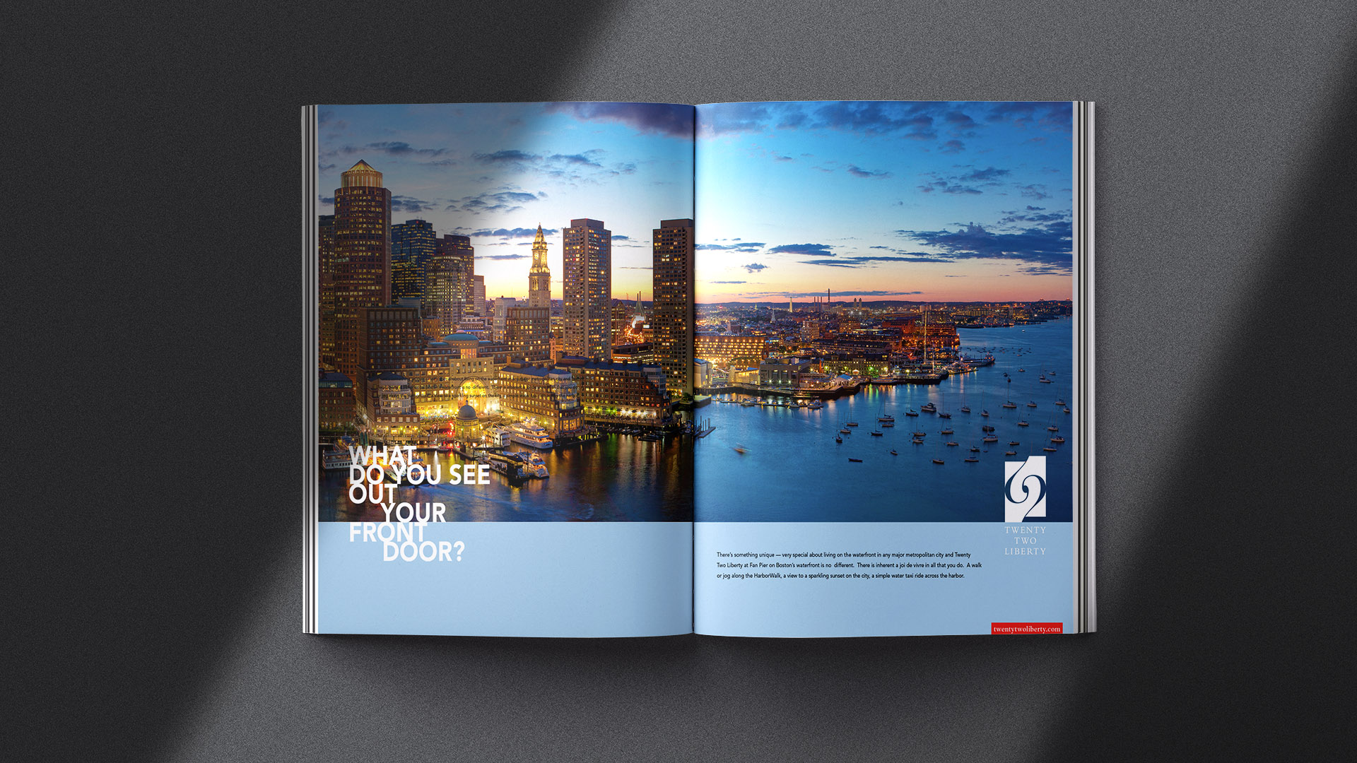
The “What do you see outside YOUR front door?” ads showcased spectacular harbor views to position Twenty Two Liberty as unmatched on the Boston waterfront.
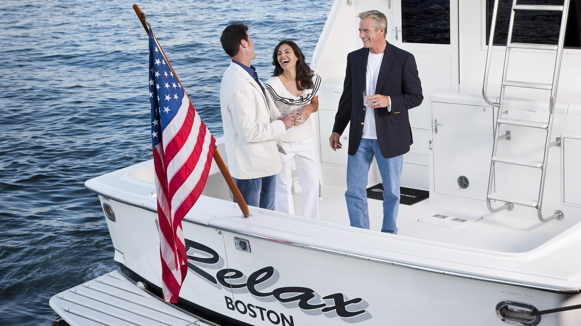
Curated imagery photographed by fashion photographer Bob Packert, highlighted the calm, luxurious rhythm of Fan Pier living—sailing, wellness, and waterfront leisure.

