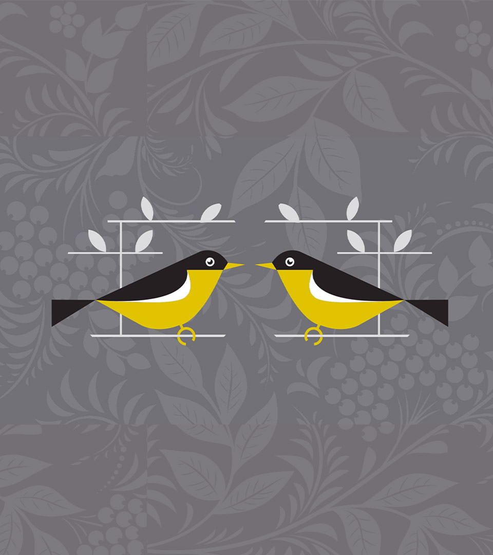
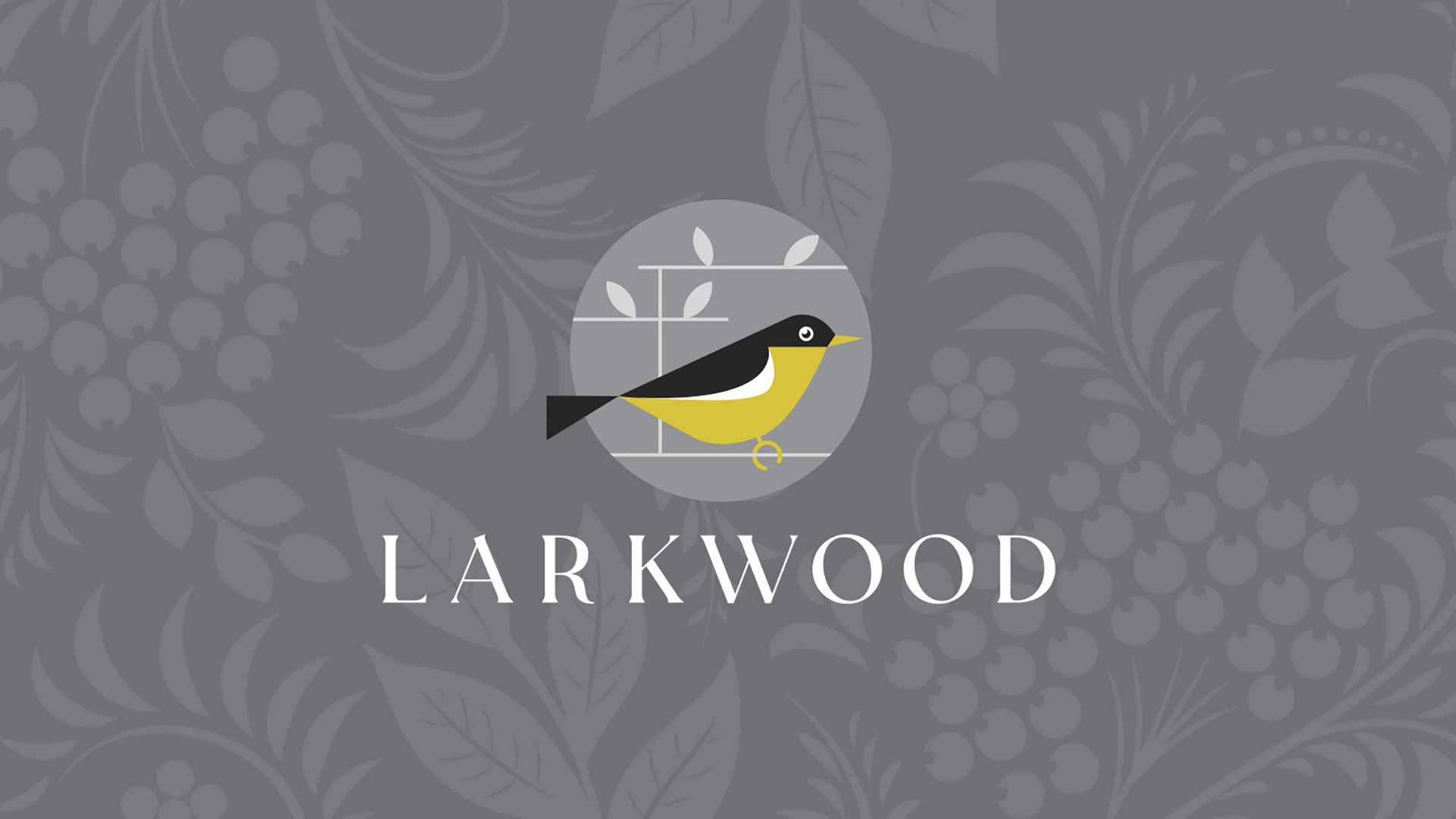
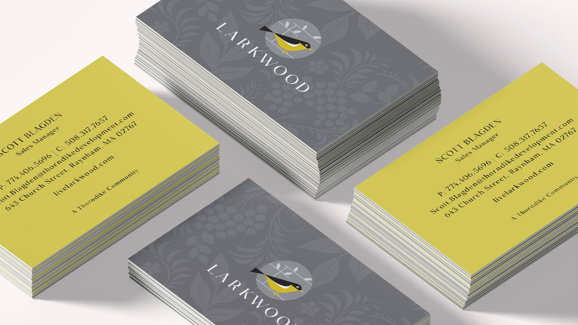
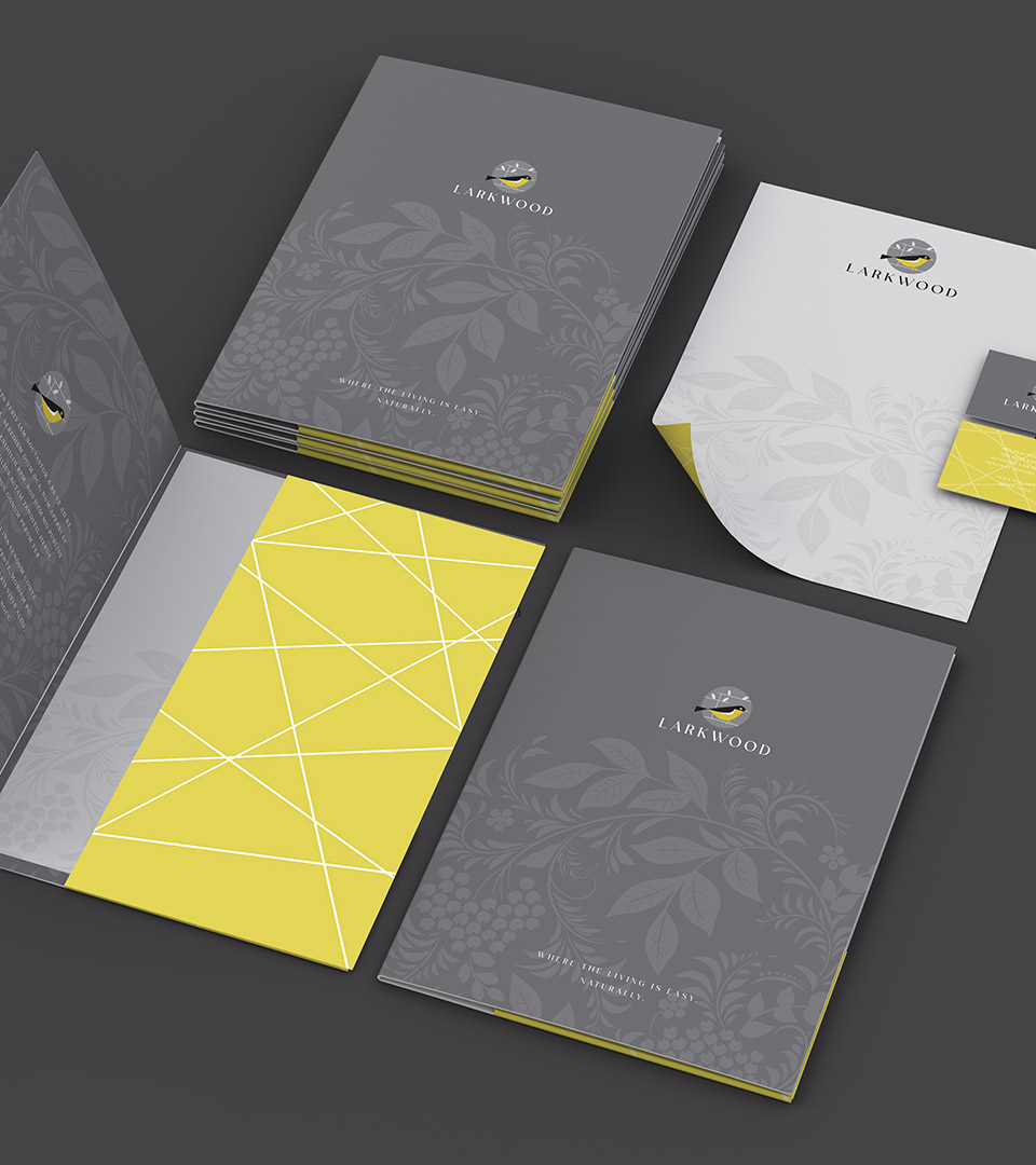
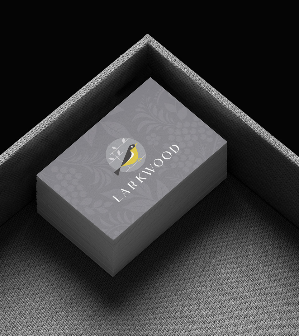
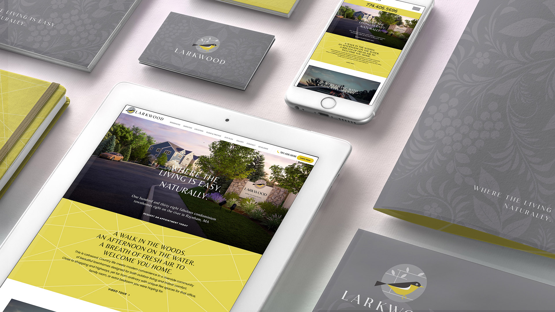
The Larkwood logo, featuring a stylized bird rendered in an elegant, geometric form, became the foundation for a system that feels organic yet polished—a symbol of lightness, ease, and a life lived close to the outdoors.
A refined palette of warm grays and fresh, sunny yellow reflects the community’s mix of natural serenity and everyday optimism. Clean typography, paired with a subtle botanical pattern, adds dimension while keeping the visual language lighthearted and to the point—never overly rustic, always crisp and current.
The tagline “Where the living is easy. Naturally.” emerged as a perfect expression of the Larkwood lifestyle, reinforcing the effortless blend of comfort, convenience, and connection to nature.
Across print, signage, sales materials, and a welcoming digital experience, the brand introduced Larkwood as a place where buyers could breathe easier, stretch out, and enjoy life with less complication and more joy.