As part of a major rebrand, we renamed Newport ONE to elevate its profile in non-profit fundraising. The new name and tagline, as well as a bold brand identity and visual language, strengthened the company’s “we do it all” approach.
Brand Strategy
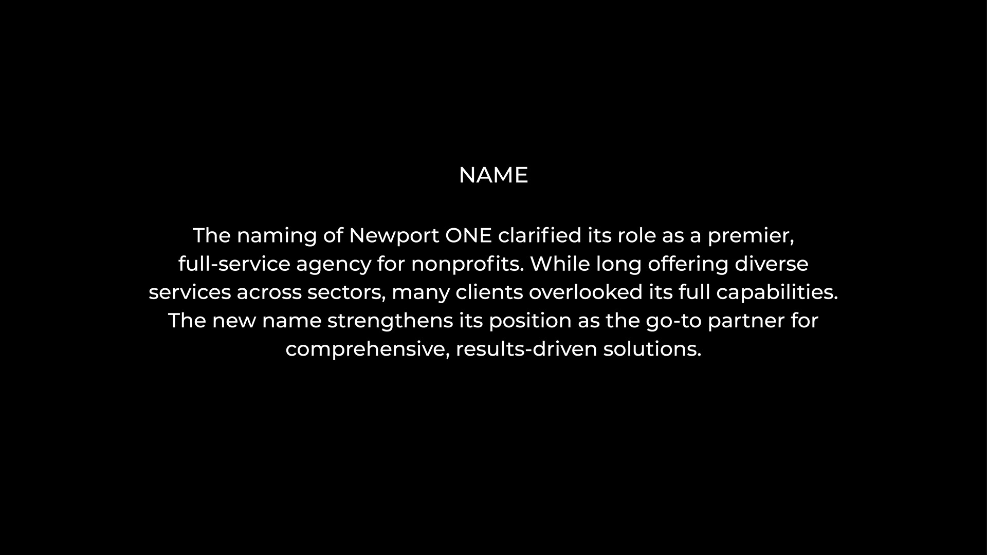
Naming
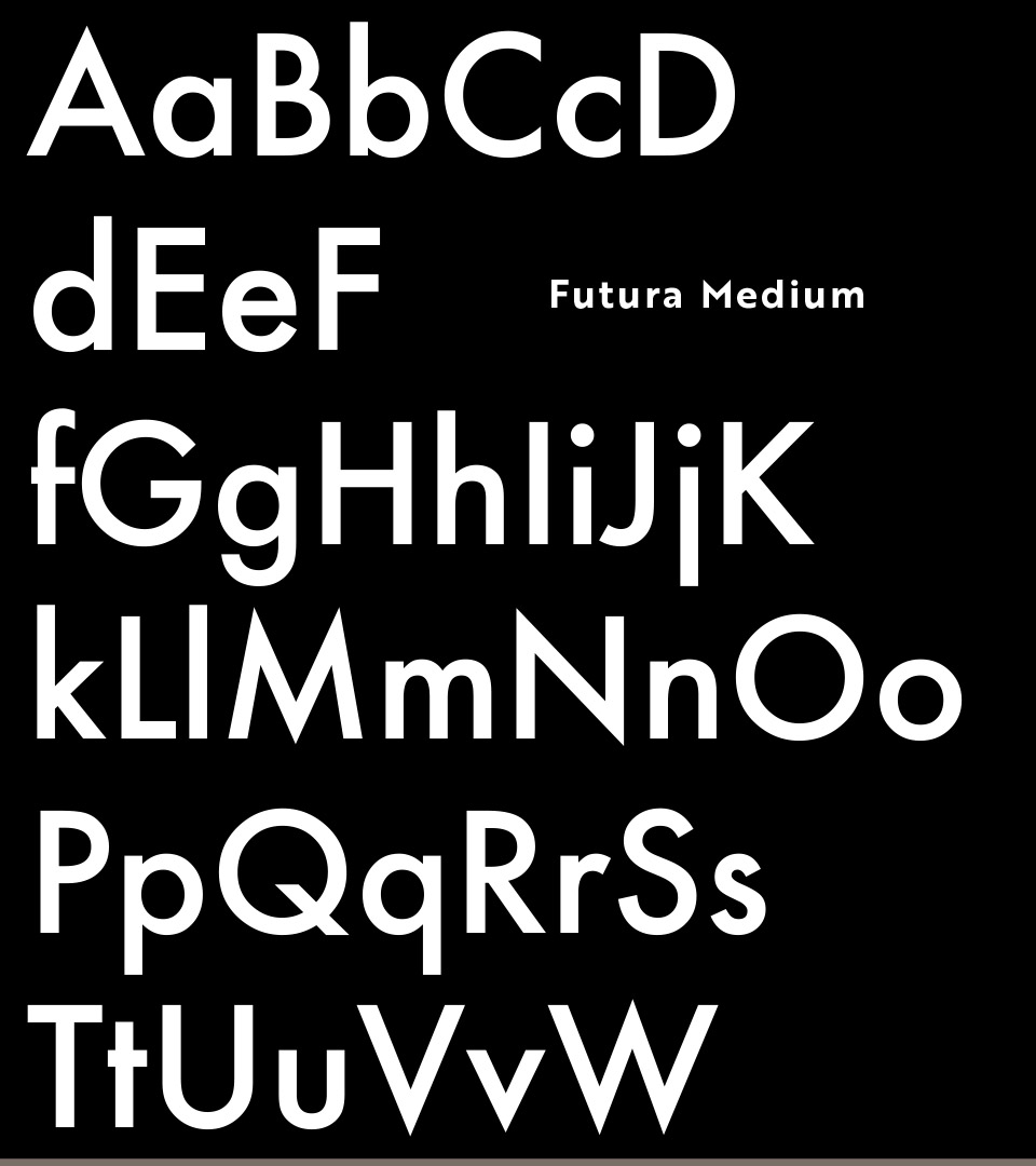
Identity
Advertising
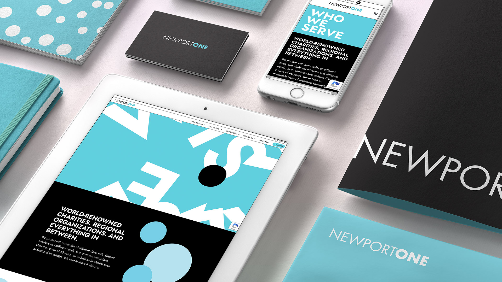
Website
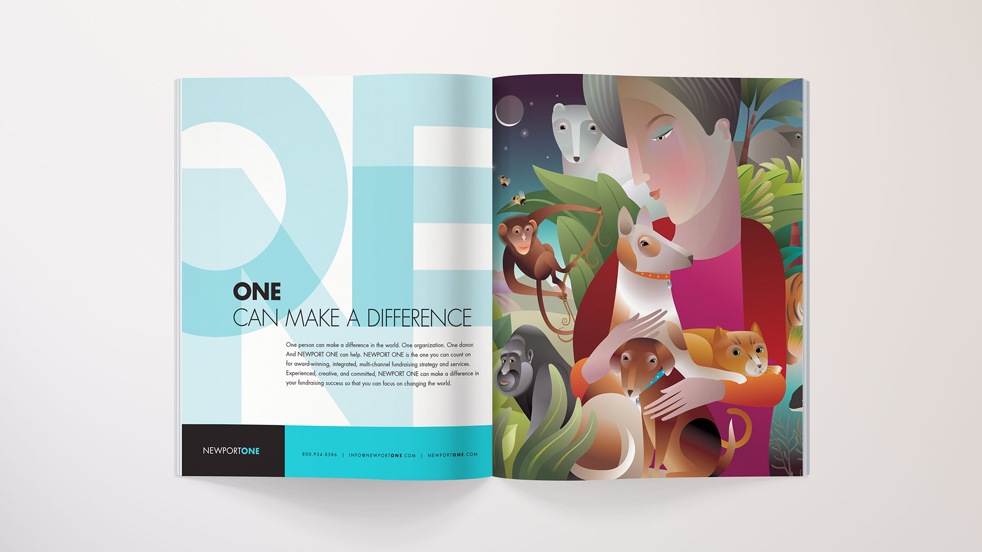
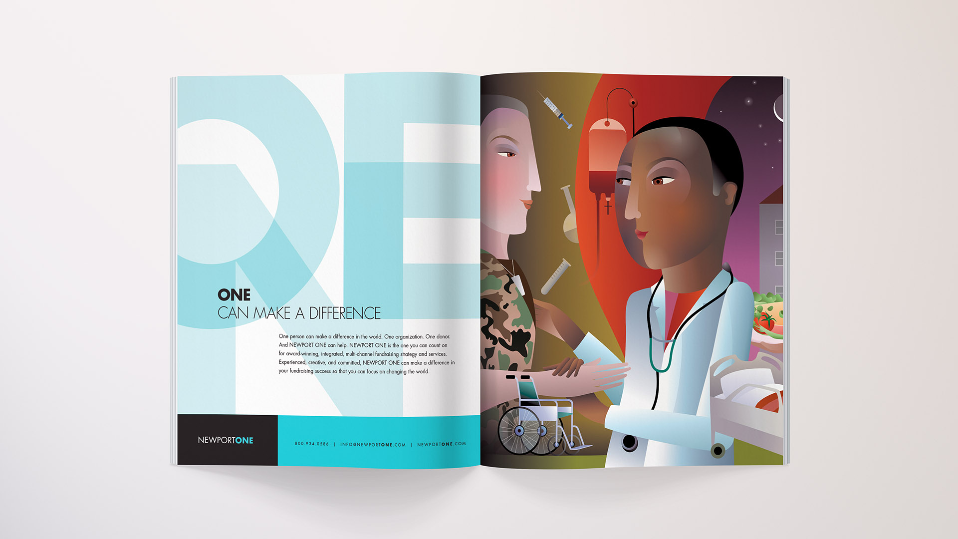
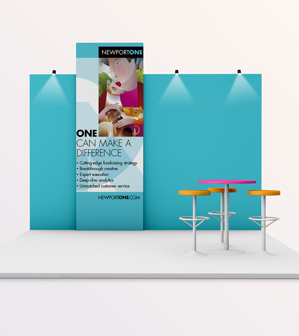
ONE CAN MAKE A DIFFERENCE
Newport ONE, a leading direct response agency for nonprofits, sought to position itself as a one-stop resource for clients.
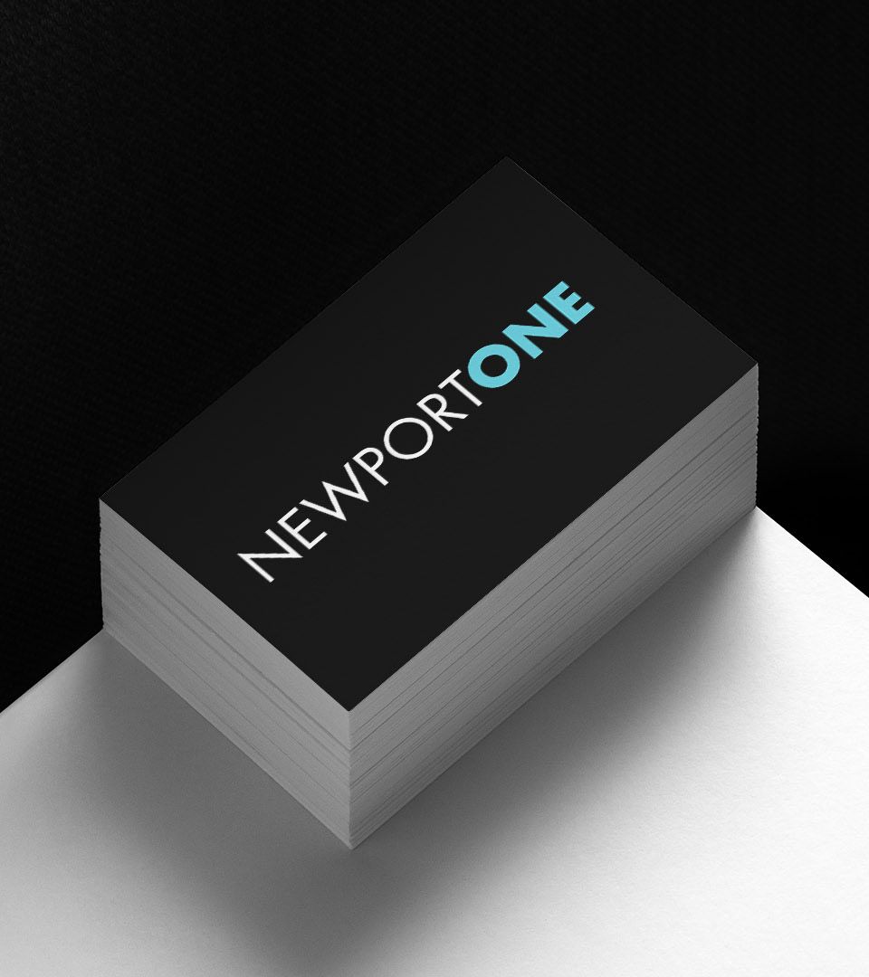
The identity centered on “ONE,” driving the logo, tagline—“ONE can make a difference”—and campaign headline, “The Power of ONE.”
Pantone Black
Pantone 3105
We partnered with illustrator Christine Beauregard to create a series of ads, each highlighting a key client type with playful, imaginative visuals.
The website combined clear messaging with bold graphics, showcasing Newport ONE’s services, expertise, and sector relationships in an accessible format.