Newbury Street is one of Boston’s most recognizable destinations, defined by its historic brownstones, independent boutiques, galleries, restaurants, and constant pedestrian energy. Despite its prominence, the avenue lacked a unified brand system—each retailer communicating independently, with no shared visual language to connect the district as a whole.
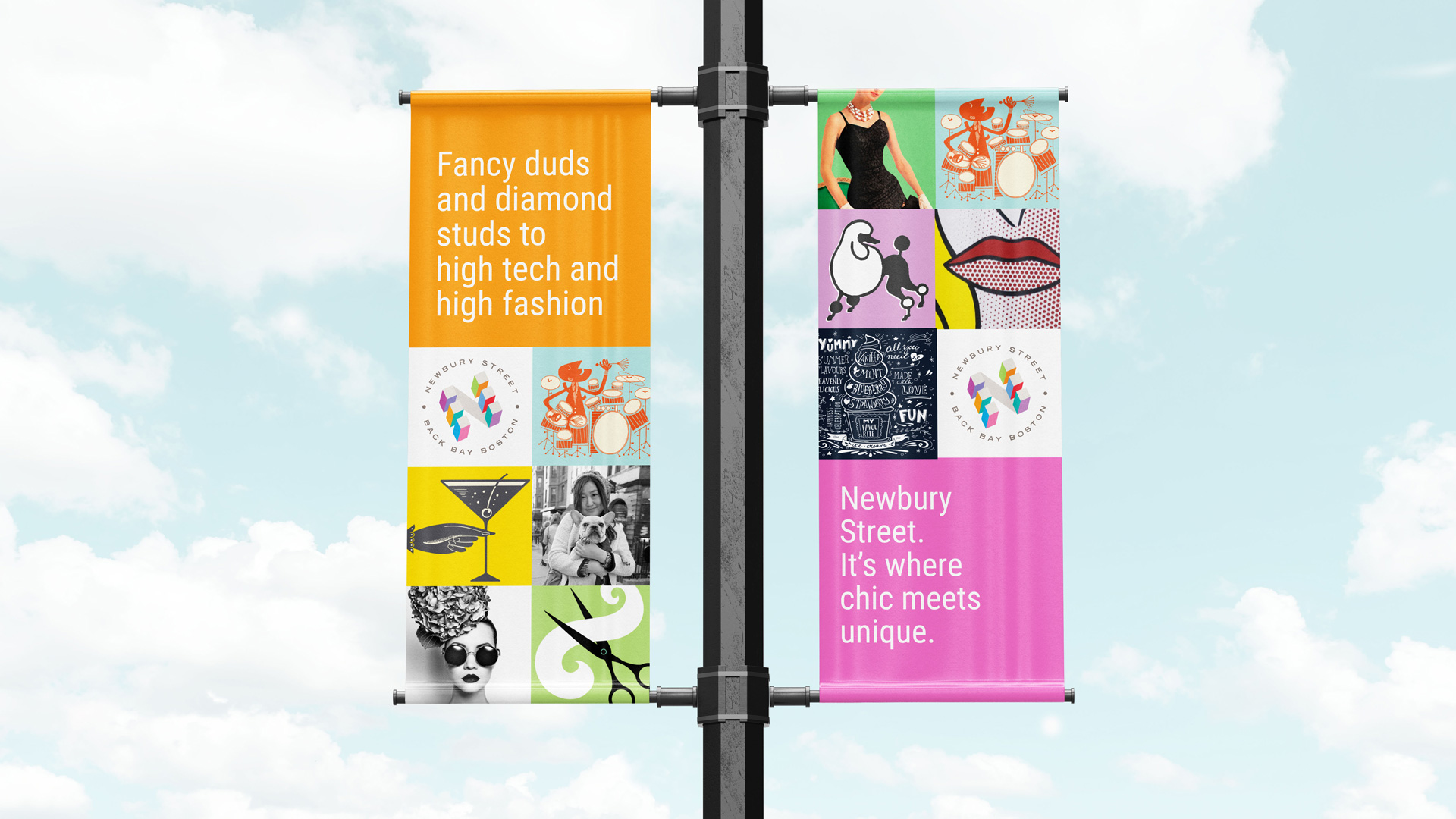
We partnered with the Back Bay Association and development stakeholders to create a flexible identity that could support hundreds of businesses while capturing the rhythm, color, and walkable experience that define Newbury Street. The logo abstracts the repeating pattern of storefronts along the avenue into a geometric system of blocks, with a subtle diagonal shadow forming an embedded “N”—anchoring the mark in both place and name.
A saturated, expressive palette reflects the street’s mix of fashion, art, dining, and culture, balanced by architectural neutrals that reference the historic streetscape. Typography, pattern, illustration, and a dynamic website extend the system across signage, digital platforms, and promotional materials—creating cohesion without uniformity.
Vivid accent colors—cyan, coral, magenta, violet, green, orange, and blue—paired with soft neutrals capture the street’s lively yet sophisticated character.
A combination illustrations and photography combined to create vibrant graphics and animated gifs for signage and the website.
An interactive website allows visitors to explore every business through a detailed, searchable map of shops, dining, and services.
The new identity unified Newbury Street visually and digitally, strengthening its presence as a destination rather than a collection of individual storefronts. Retailers gained a shared system for promotion and events, while visitors gained a clearer, more engaging way to explore the avenue.
The result is a bold, contemporary brand that feels authentic to Newbury Street’s history, diversity, and unmistakable street-level energy.