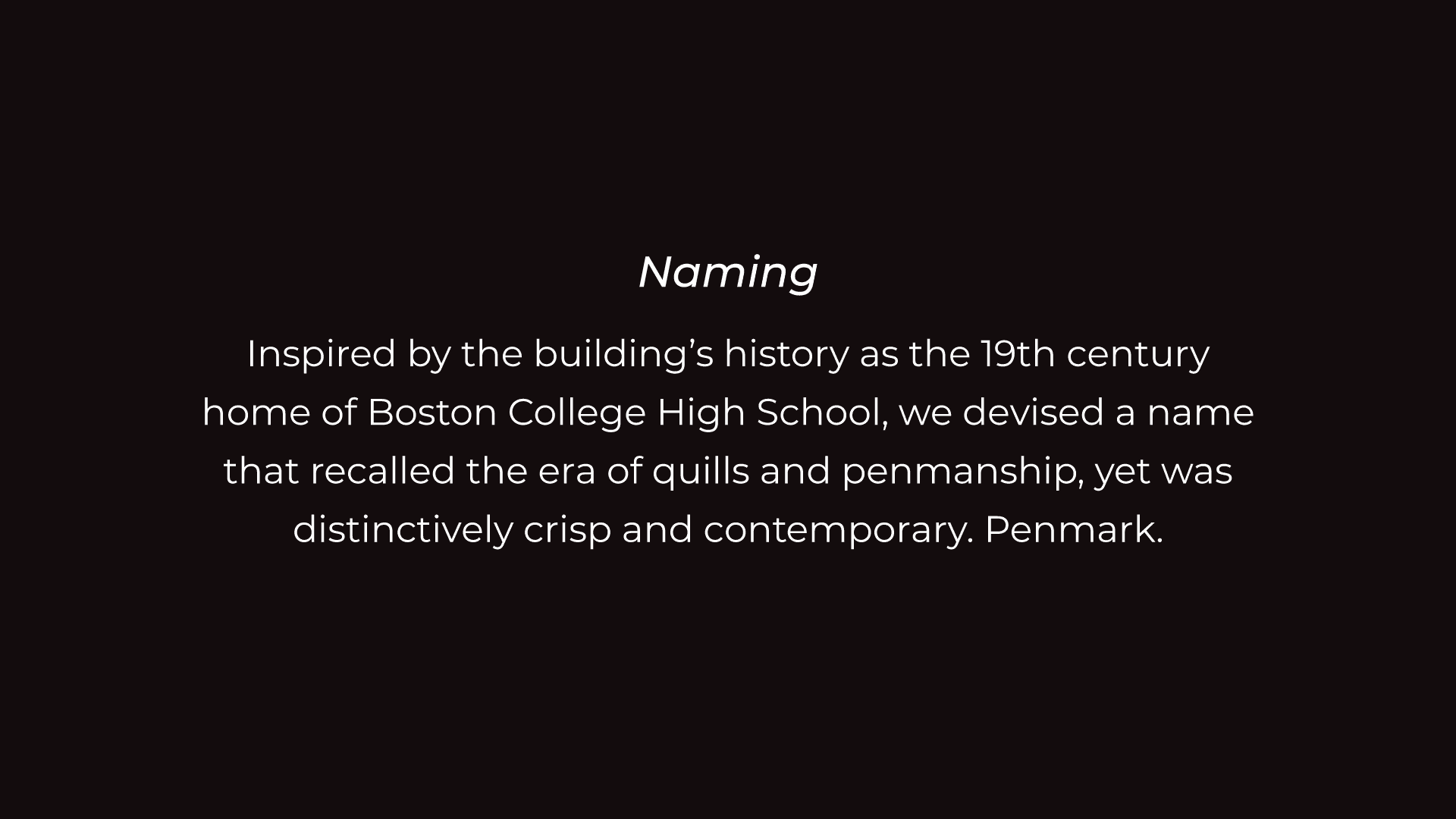
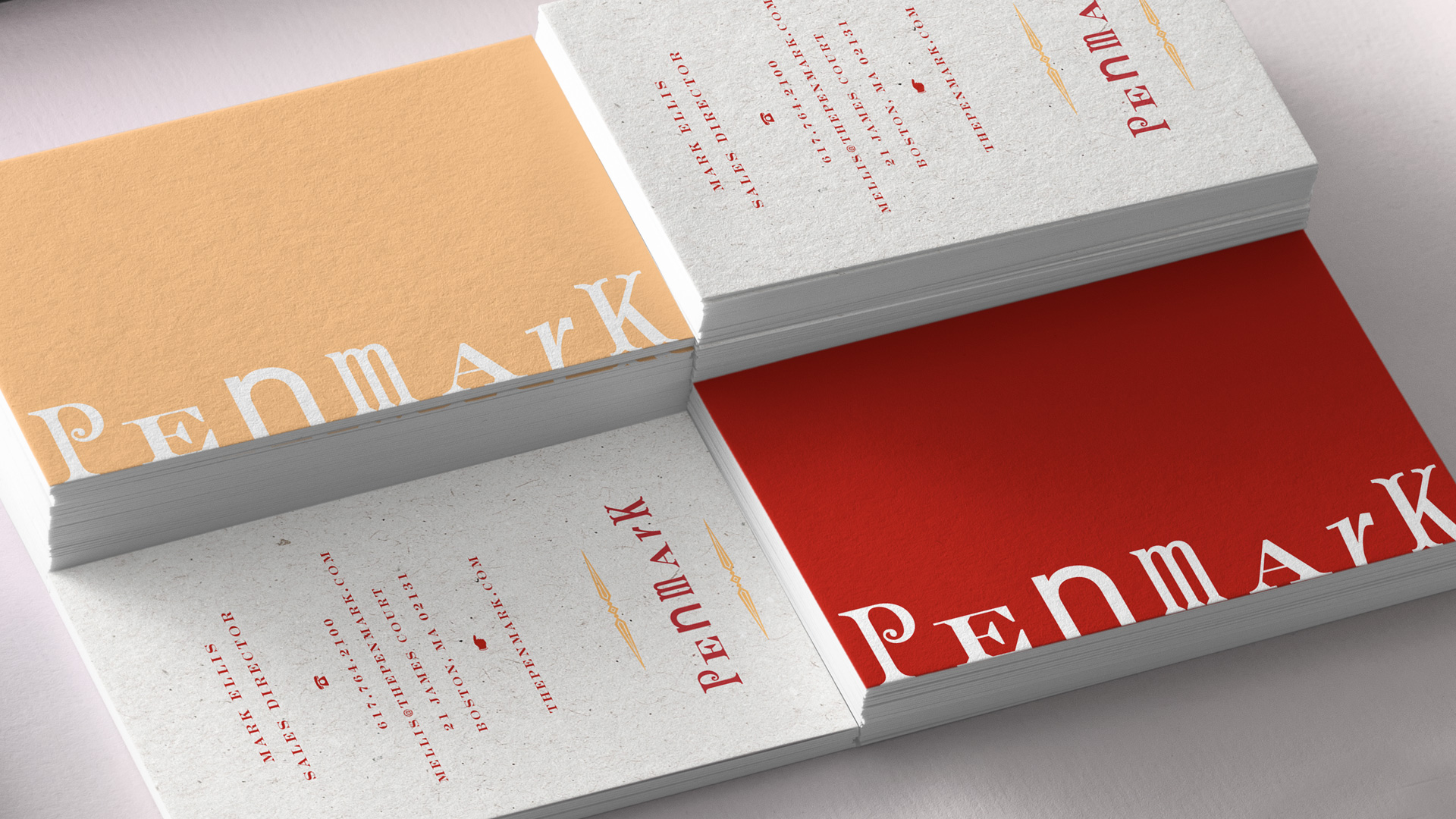
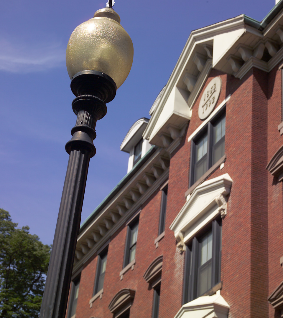
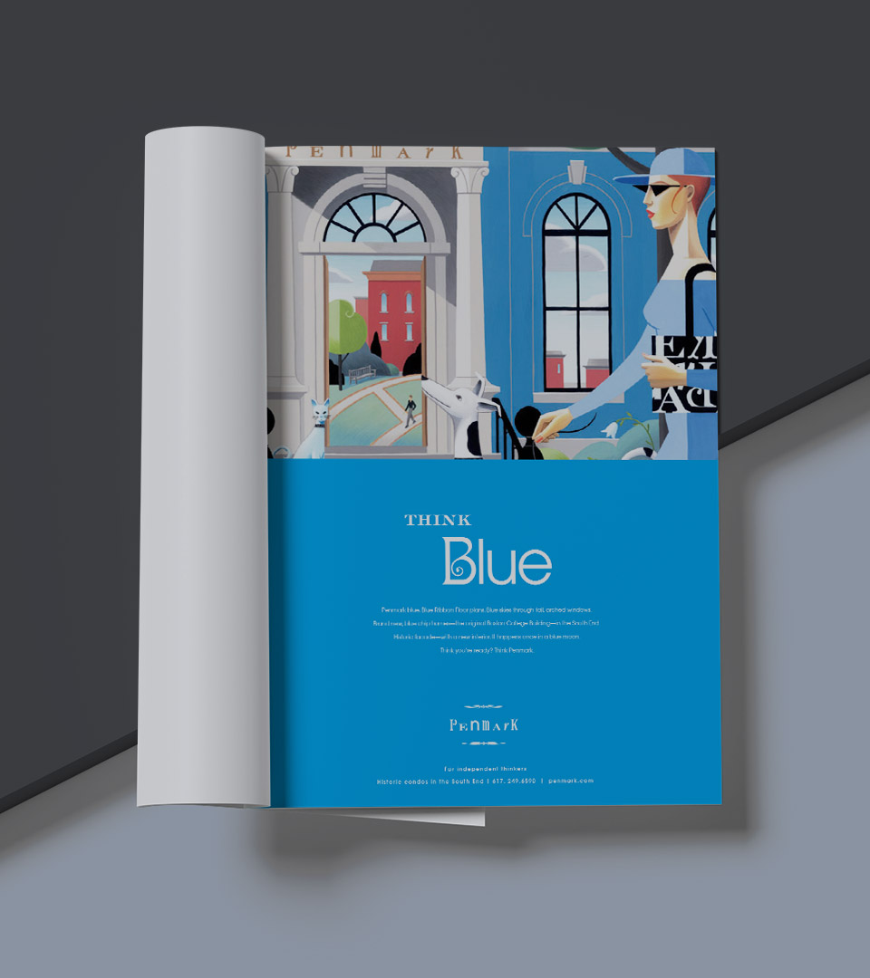
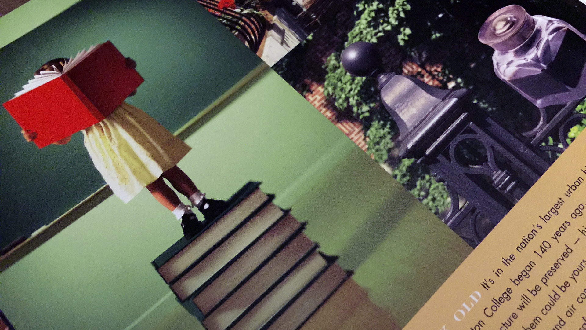
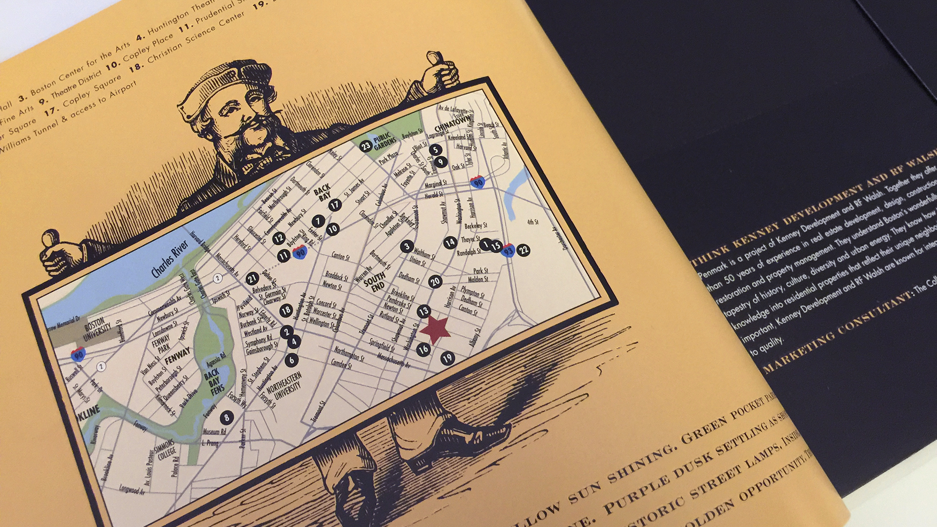
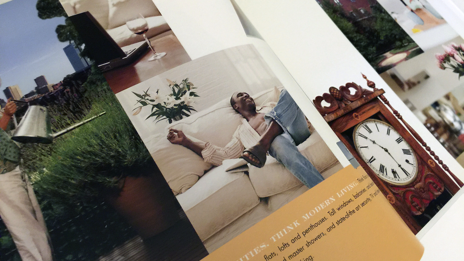
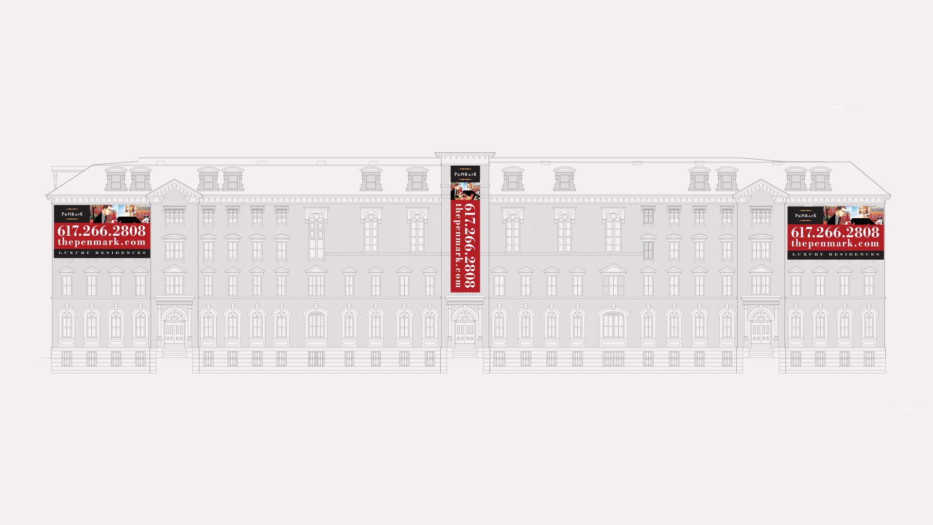
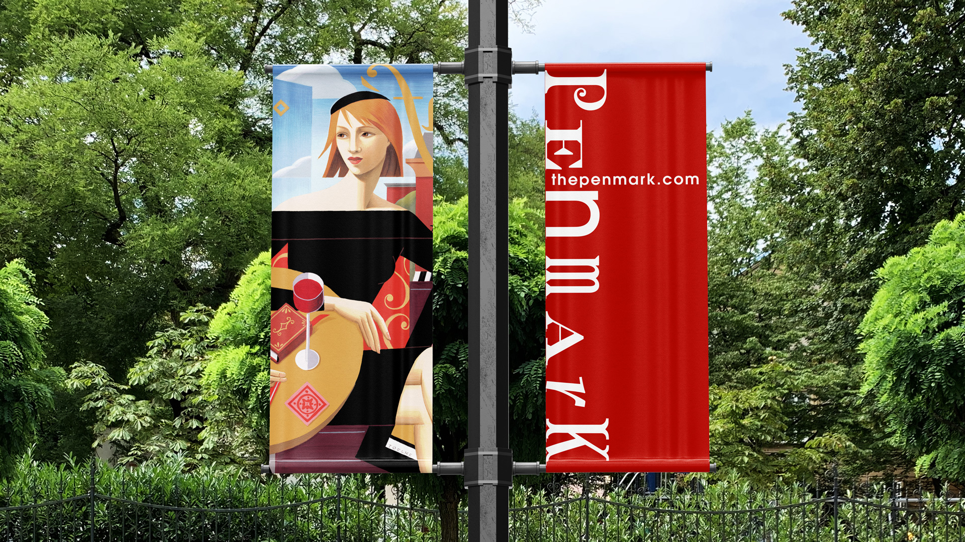
penmark living room with windows

FOR INDEPENDENT THINKERS

Making old new

The old and the new came together in Penmark. Built in 1863, this old school building now houses contemporary luxury condos, its historic past in contrast to its arty, do-your-own-thing SoWa neighborhood. By capitalizing on both, we not only created a vibrant brand image for these new residences but also defined a new neighborhood and lifestyle. The choice to use illustration pays homage to the artists and galleries of the South End.

penmark red image for print ad campaign
Penmark naming

Our scope included naming the building and then creating an iconic logo. Because the building was constructed in the 1860’s as a school, we based the logo on mid 19th-century Victorian advertising fonts. We used red and yellow as the primary palette and the jumping off point for the illustrations.

Penmark business cards
Penmark color palette of black, red and golds
penmark victorian fonts on white
Exterior of Penmark with lamppost
Penmark iron gate

We worked with illustrator Cathleen Toelke to create these quirky, fun illustrations for the marketing materials.

The umbrella theme of the ad campaign was “For independent thinkers,” alluding to residents of the eclectic neighborhood and to the free-thinking lifestyle built around Penmark. The ads followed this up with a theme built around the color of the illustration, Think Red, or Think Blue.


penmark think red ad
Penmark Think Blue magazine advertisement
Penmark brochure and holder
penmark girl reading red covered book standing on books
penmark brochure map of boston
penmark brochure spread with african american on white sofa and clock
penmark brochure man playing saxophone and man painting
Penmark elevation drawing with banners
Penmark condos pole flags by
Penmark website on desktop computer
Penmark website on tablet


Adams Design
20 Park Plaza
Boston, MA 02116

Let's Talk!