Noannet

A refreshed corporate identity for a mission-driven Boston real estate developer

Noannet is a Boston-based real estate development firm known for context-sensitive buildings that strengthen neighborhoods, encourage community connection, and elevate the civic realm. They approached us to create a unified corporate identity that captured their mission—development grounded in integrity, longevity, and thoughtful urban stewardship.

Client
Noannet
Industry 
Real Estate Development
Scope of Work 
Brand Strategy, Brand Identity, Visual Language, Print, Website
Noannet logo on white box—abstract “N” mark representing architectural connection
noannet logo on white hardhat

The Challenge

Noannet needed a sophisticated, modern identity that could express both sides of its brand.

Develop a modern, professional identity that communicates credibility, stability, and expertise—qualities essential for a company leading complex real estate developments across multiple communities.

Close-up of Noannet logo with green and navy color palette

The Solution

We developed a refined, contemporary identity system anchored by a custom abstract “N” mark—its interlocking forms referencing architectural movement, connection, and the company’s commitment to shaping coherent urban environments.

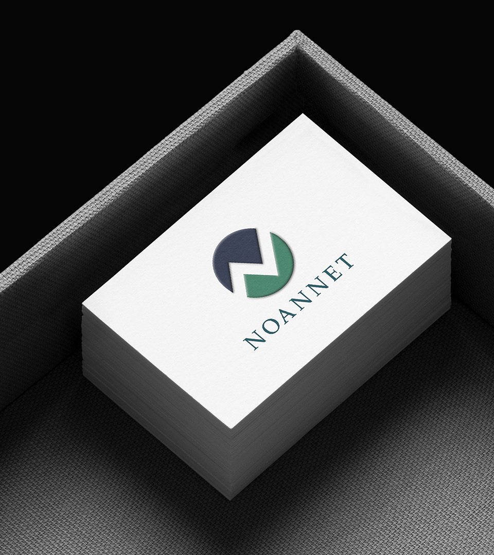
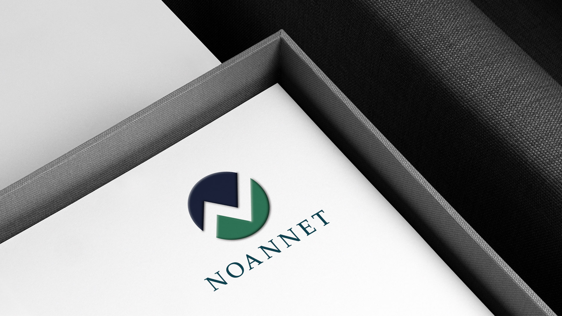
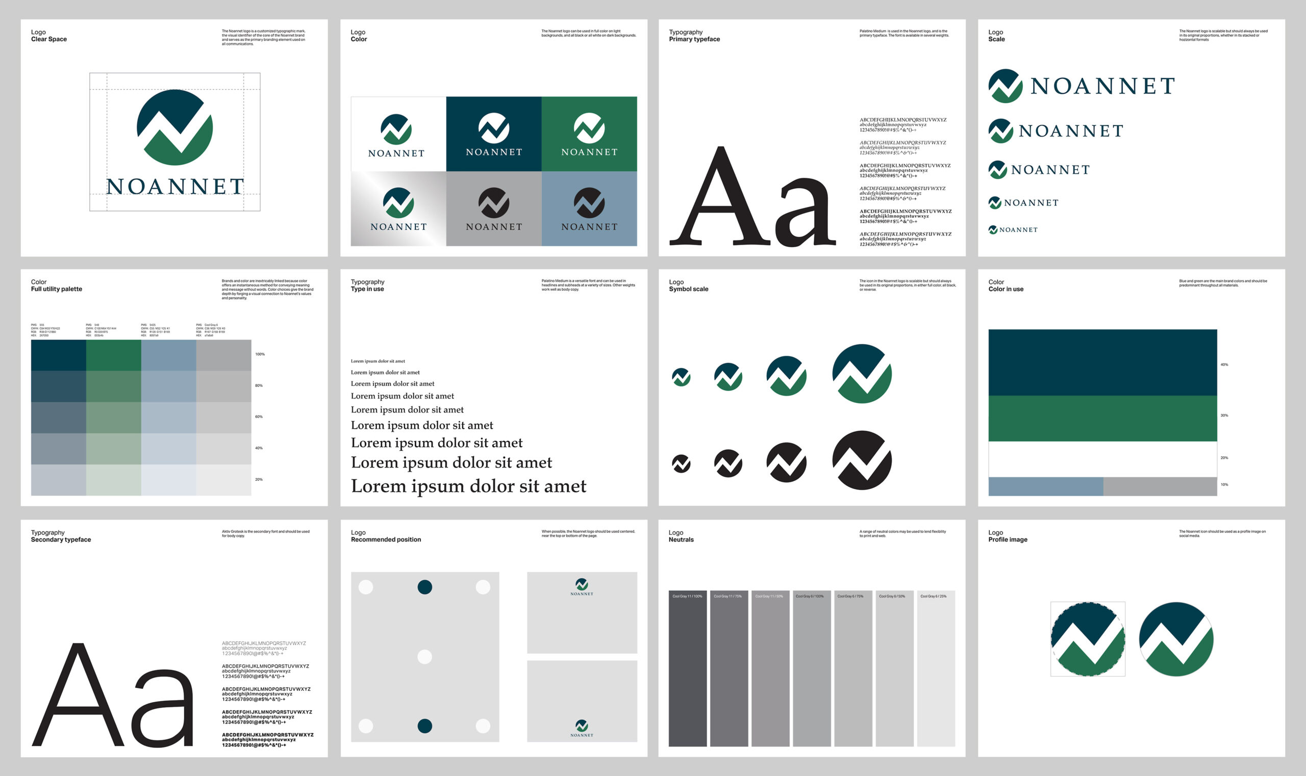
The mark pairs with a classic wordmark and a palette of deep green and navy, balancing modern design with a heritage tone that conveys trust, stability, and civic responsibility.

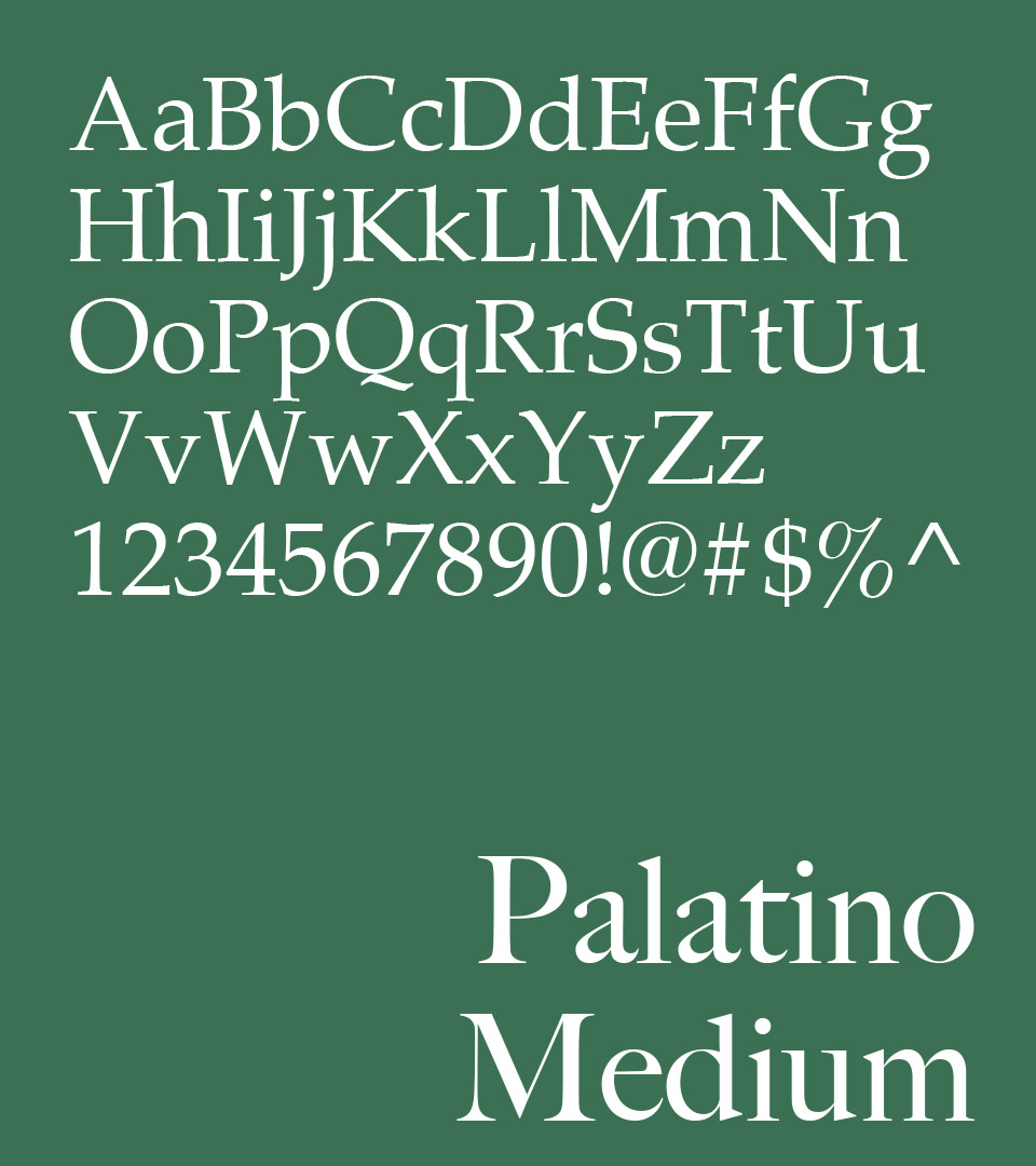
Typography further reinforces this duality: Palatino Medium offers historical gravitas and readability, while modern sans-serif accents support clarity in detailed proposal work.

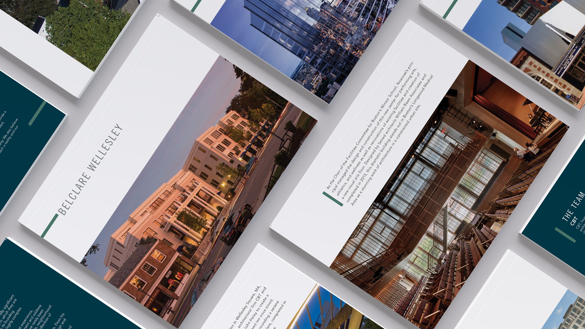
A flexible system of templates, patterns, and layout rules gives Noannet a complete toolkit for presenting projects, sharing impact, and communicating with investors, municipal partners, and community members.

Noannet brand typeface palette featuring Palatino Medium

Palatino Medium was chosen for its blend of professionalism and warmth—evoking long-form communication, civic clarity, and enduring design.

The palette combines grounded natural tones with clean corporate neutrals—reflecting Noannet’s connection to land, community, and long-term development while maintaining a modern, professional presence.

Noannet business cards in forest green and navy

A cohesive system of stationery, business cards, and templates ensures that every touchpoint—internal and external—communicates consistency and polished professionalism.

Noannet brand guidelines pages showing logo usage, grids, and icons

We developed a comprehensive style guide for the logo for consistency in then brand going forward.

Print collateral and digital templates laid out in a grid

Corporate website offering company insight, project highlights, and brand storytelling.

noannet.com

Mobile and desktop website layouts for Noannet corporate site

The Resullts

The new identity gives Noannet a strong, recognizable corporate presence.

The brand strengthened trust, elevating communications, and supporting the company’s growth as it expands its portfolio of residential and mixed-use developments.


Adams Design
20 Park Plaza
Boston, MA 02116

Let's Talk!