A refreshed brand identity rooted in coastal heritage, elevated service, and modern Boston waterfront living.
Located on Boston’s flourishing waterfront, the Seaport Hotel needed a revitalized brand identity that honored its maritime roots while meeting the expectations of today’s discerning travelers. The goal was to express the hotel’s warm, guest-forward service and contemporary sensibility in a way that felt both unmistakably Boston and distinctly Seaport.
Client Fidelity Industry Hospitality, Food & Beverage, Tourism Scope of Work Brand Strategy, Brand Identity, Visual Language, Print, Signage, Video, Website Design, Advertising
The Challenge
The Seaport Hotel required a brand system that could unify its many touchpoints—hospitality, dining, events, wellness, meetings, weddings, waterfront experiences—into a cohesive whole.
The identity needed to feel premium without pretension, capture the property’s maritime heritage without slipping into nostalgia, and remain flexible enough to support everything from business travelers to wedding celebrations.
The Solution
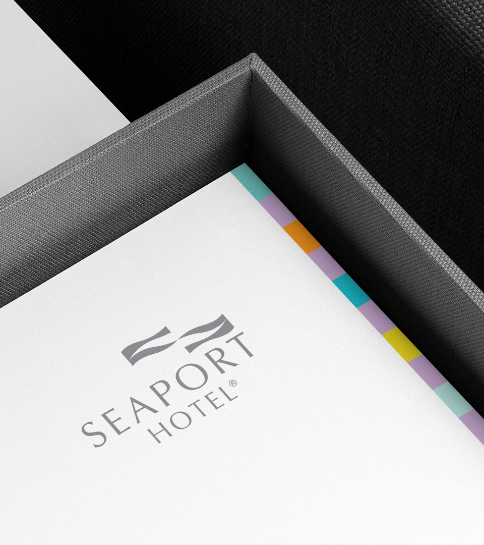
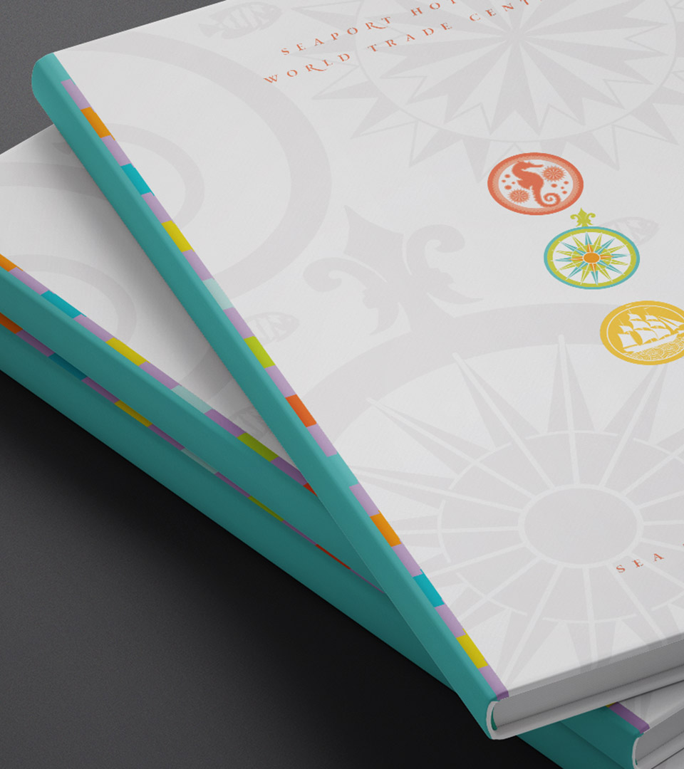
We developed a visual identity anchored in Boston Harbor’s maritime history, the identity blends navigation maps and seafaring symbols to evoke modern coastal elegance and a spirit of exploration.
The brand language expands through a pastel icon system that differentiates the hotel’s offerings, a refined yet approachable palette inspired by ancient nautical charts and shoreline colors, and tactile materials that convey understated luxury.
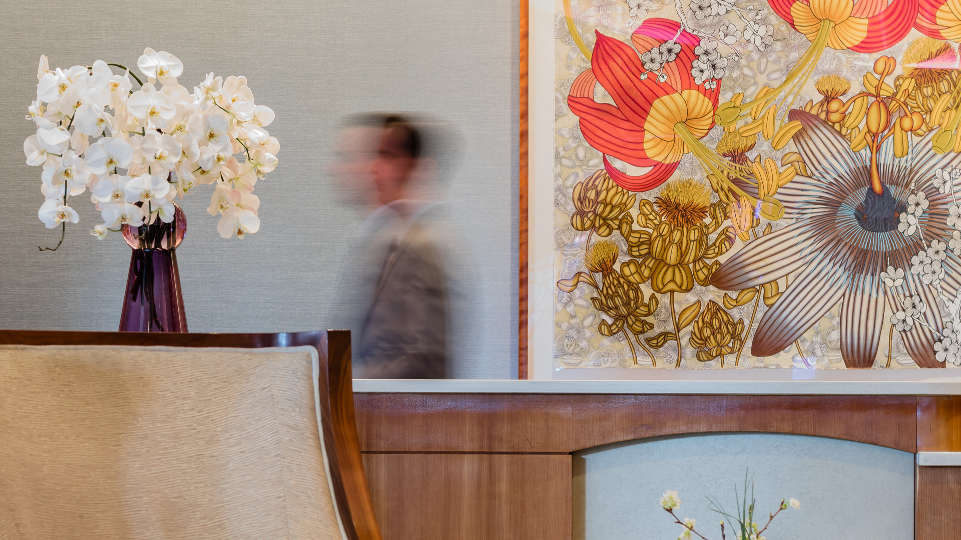
Photography and illustration work together to balance warmth with sophistication—firelit lounges, waterfront paths, handcrafted cocktails, and quiet moments of guest experience.
The tagline “Sea the Difference” captures the hotel’s unique blend of service, setting, and serenity.
A classic font adds elegance to the tagline, “Sea the Difference” as it captures the hotel’s unique blend of service, setting, and serenity.
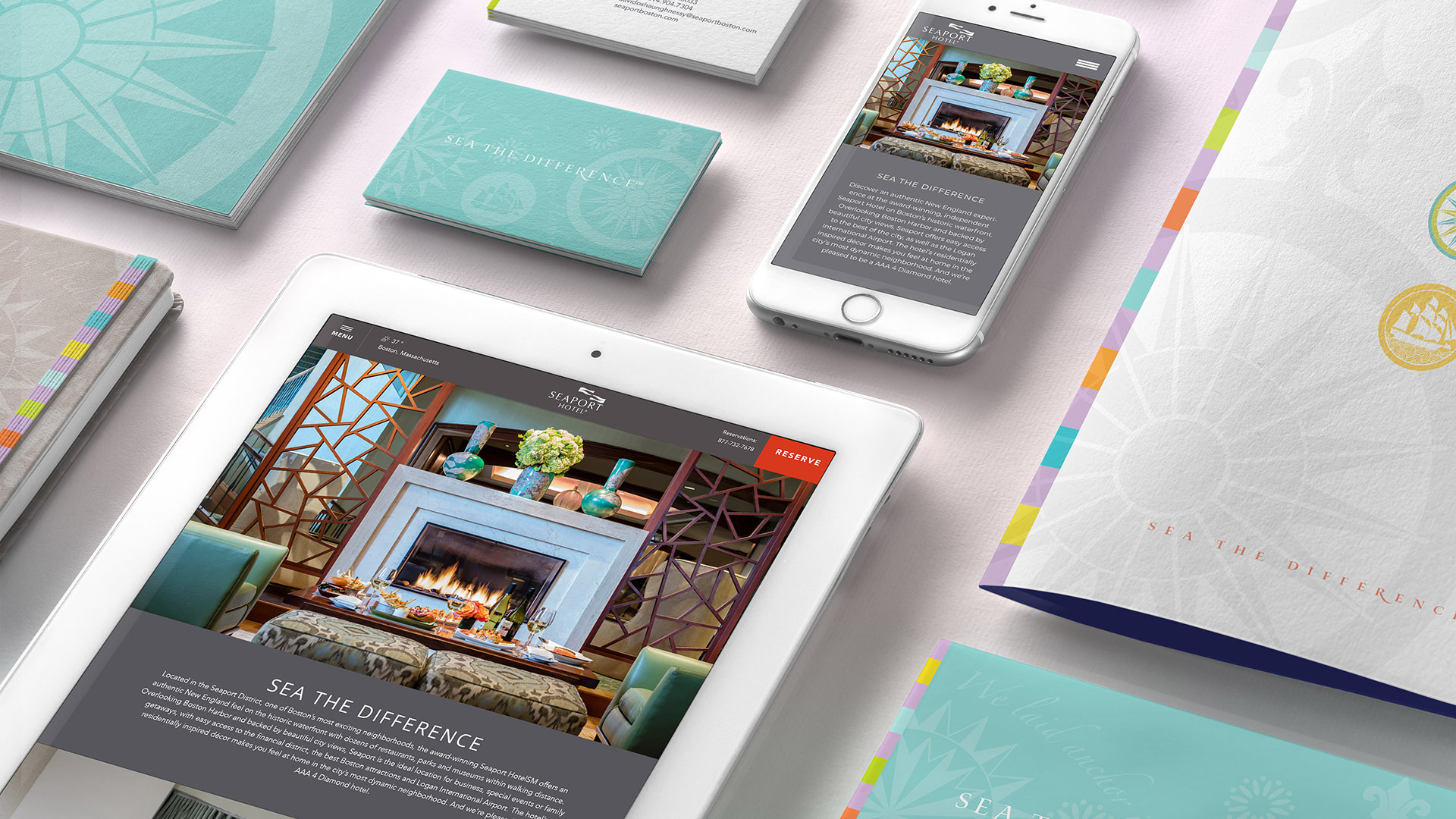
The color palette draws from sea, sky, and shoreline—charcoal, coral, teal, and mint—balancing sophistication with coastal ease.
Door hangers and the Guest Services Book, all demonstrate the system’s cohesion, delivering a refined guest-facing presentation.
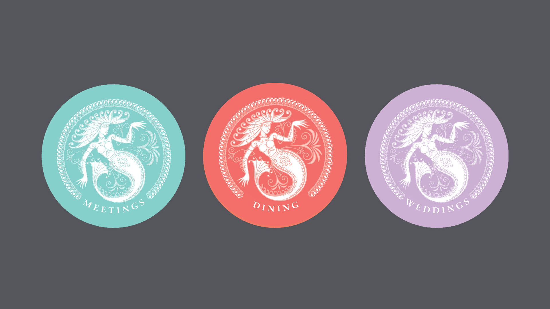
A suite of pastel mermaid icons distinguishes key hotel amenities while adding a playful, contemporary layer to the system.
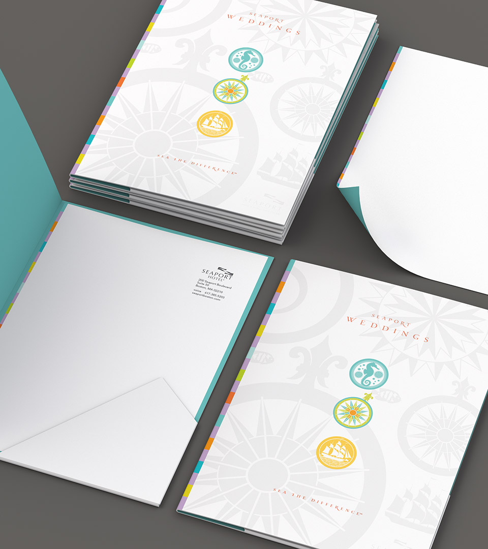
The suite of brochures pair calm waterfront photography with welcoming copy, reinforcing the Seaport’s signature viewpoint while carrying through the visual language on the covers.
We extended the brand across all marketing materials, using original photography to create a cohesive set of brochures for weddings, events, guests, and general audiences.
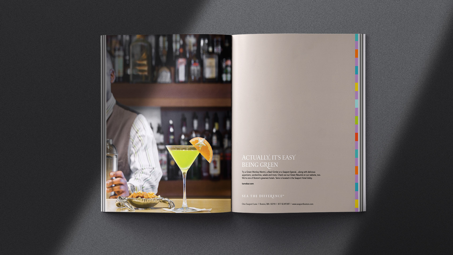
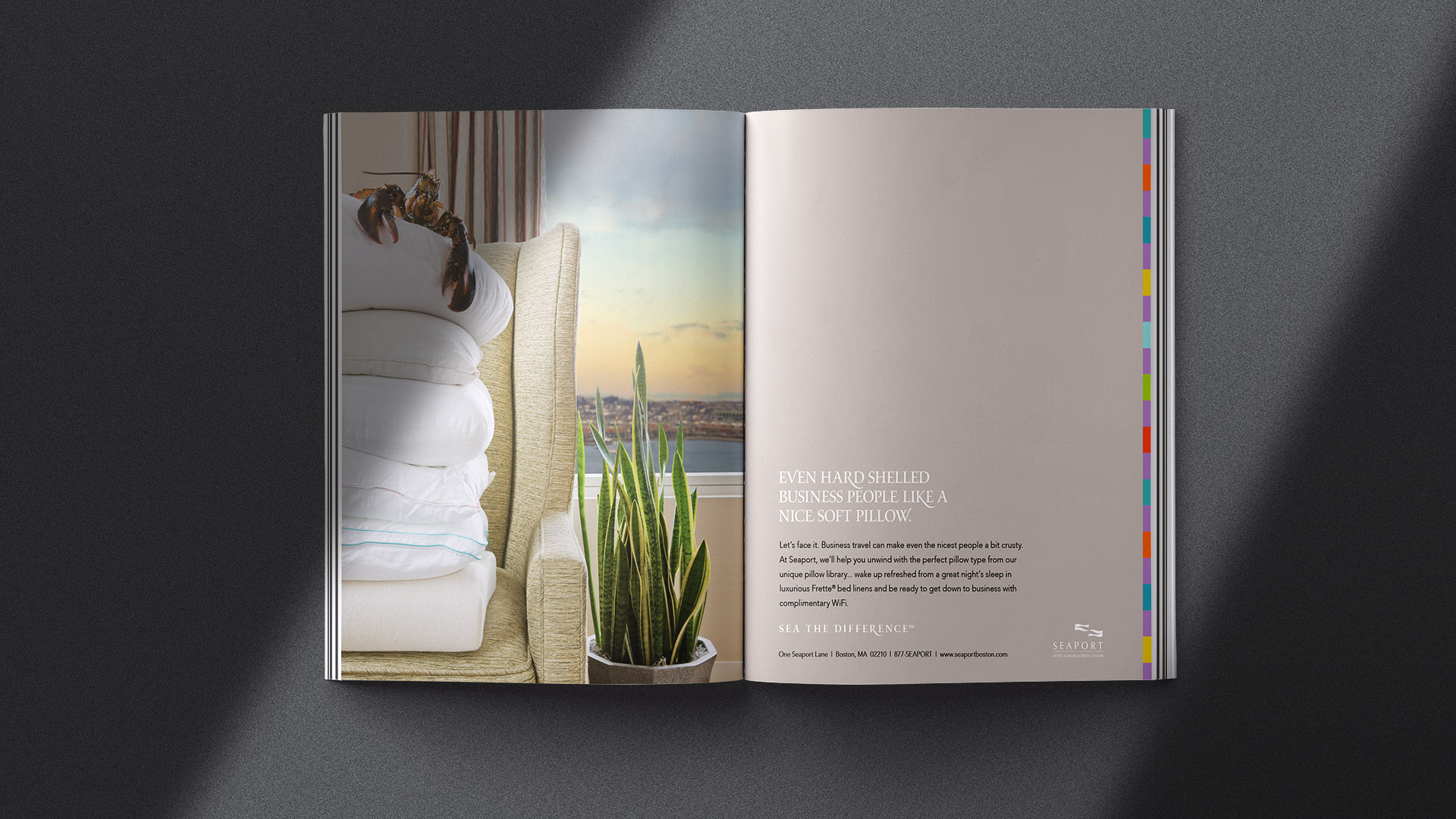
We created a focused ad campaign showcasing the hotel’s key offerings, tailored to resonate with a range of audiences with a bit of humor.
The Results
The refreshed identity reintroduced the Seaport Hotel as a distinctive, hospitality-driven destination on Boston Harbor.
The new system elevated every guest touchpoint—from in-room materials to event collateral—strengthening brand cohesion and reinforcing its status as one of the Seaport District’s most welcoming and memorable hotels.